Lois van Baarle, better known for her tradename, Loish, is a freelance digital artist and animator residing in Utrecht, the Netherlands, who is breathing new life into the prospects of young artists and illustrators. Born in Holland, Loish writes that she has lived all over the world, and her career has allowed her to lend her talent to other media including design work for Wacom packaging as well as character design for the Sony Interactive Entertainment game, Horizon: Zero Dawn.1 What is perhaps the most incredible was that she was able to develop this highly successful career completely on her own terms.
Although she is best known for her expressive character designs, one of the most impressive aspects about her career is her ability to market her work and flourish in the new age of digital art-making where social media is the new form of appreciating art. She creates what can be described as “popular art” but her ability to differentiate between stylization and idealization has been a site of inspiration for my own work.
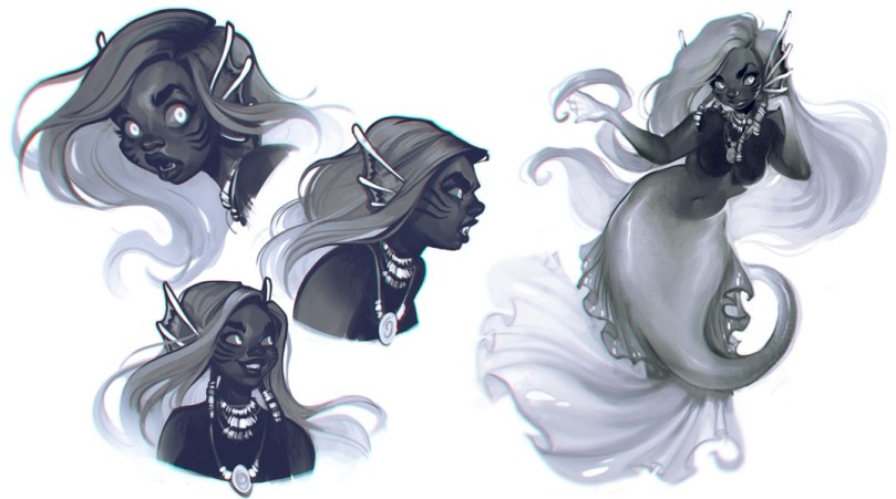 Baarle, Lois Van. 21 Draw: Mermaid. 2014, Digital.
SHAPE
An example from a page pulled from a design reference book Loish contributed to gives us a glimpse on many of the elements that are prevalent in the rest of her work. She puts an emphasis on soft curves as opposed to hard angles. Her characters as well as her environments tend to be rounded as the encapsulation of a gentle flow is a priority in every piece she makes. Her shapes are largely organic and rather round. The entire figure can be broken down into spheres and cylinders.
MOVEMENT
I would say that the emphasis on movement is above all else. She largely captures this in the hair of her character designs such as the one above, as well as in subtler ways such as the openness of the poses as well as the details of the design (ie the face markings, curved ears, and arched eyebrows). All elements are leading out and around, interweaving into one another to create movement that is inherent in the character rather than that which is caused by external forces. This sense of movement contributes to the ethereal atmosphere of the character and pushes the fact that she is of an otherworldly grace.
Form
The character is highly stylized, putting emphasis on large eyes and a plump, stylized face shape. She also has a defined sense of presence and has a well-established sense of weight. Her work is highly feminine, and resembles artworks by Disney.However, as aforementioned, the character may be stylized but is not on the whole idealized. Unlike other renditions of mermaids, this character has realistic areas of fat deposits which she carries in her tummy, arms and cheeks. She has a short torso and an overall stout composition. Her characteristic nose is large and bulbous, and her brows are wild. Her expressions lead us to believe that she is not the ideal prodigy of beauty in her tendencies.
In an interview with Loish, the interviewer pointed out that a lot of the characters she creates resembled her, which is the tendency of a lot, mostly new artists. Loish then outlines how this is a result of how she makes her characters more believable. “I want the details of the character – for example the eyebrows, the corners of the mouth, or small imperfections – to convey a sense of the character being tangible and human.”2
Oftentimes she uses her own imperfections as inspiration, to ironically, make her art more beautiful.
Value
In this example, Loish is using a common trick in concept design which is to paint in grayscale. This allows the artist to be free of color development and dedicate their process to the conception of value and contrast. Whilst the character is devoid of any other, the monochromatic values are still incredibly striking, and the contrast serves to lead our eyes to the elements that Loish deemed most important for the character. The eyes, ears and jewelry are almost pure white elements on a dark background and thus create the focal point around her face. Even though the bottom half of the character is arguably the most defining feature of this character, Loish diverts our attention to the face, making us appreciate the expressiveness and humanness of a very nonhuman character.
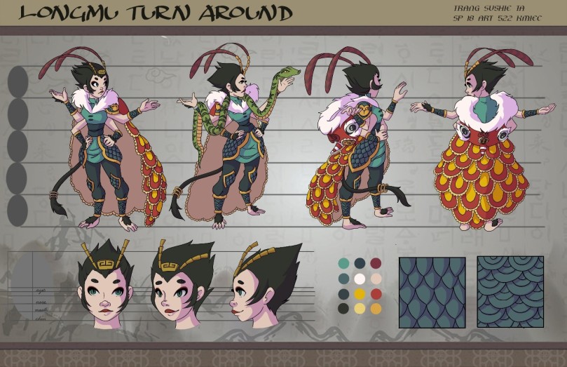
Ta, Trang. Longmu: Turn Around. 2018, Digital.
This was a character I developed as part of a class project. While not directly producing this piece after a Loish piece, several of her pieces did make into my mood board when developing this character. Like Loish’s character, this character is also slightly anthropomorphized as “Longmu” as I incorporated monkey-like elements to the character, inspired the stories of Chinese “monkey kings”. The degree of animal incorporation is similar, having a largely human like appearance with a few sprinkles of animalistic properties (ie a tail).
You can see Loish’s influence in the stylization of the character. It is most evident in the large size of the eyes as well as the wide nose and the soft round shape of the face. This character is also largely rounded in shape, which can be seen in the face, torso, hips as well as throughout her outfit, especially with the patterning on the cape. Circles and ovals were heavily utilized to signify a sense of softness and femininity. Like Loish’s piece, this was to denote that the character was the hero of her story and incorporate a sense of innocence and youth.
However, one difference is that the shapes are very dramatic in proportion and this removes the believability and realism from this character. Because this character was made to be a representation of a mythological creature, it makes no attempt to be realistic. No one would ever believe that there was a person like this. The character does seem to have a sense of presence but at 5 heads tall and a waist the size of her neck, the piece reads more two-dimensional than Loish’s piece, having some planes that are solid color that read as completely flat.
Compared to Loish’s piece, the character I produced is much more static. The character stands in a very simple posed and does not seem to harbor any sense of atmospheric movement and is totally separate than her environment, whereas Loish’s characters seem to be a leaf in the wind in the environment where they are placed. The lines in this character are largely introverted, bringing the eye into the character rather than out and around the character. There are some attempts at bringing the eye out (such as the tail and feathers), but on the whole, there is very little inherent movement built into this character.
Value development on Longmu was very similar to Loish, as can be seen below:
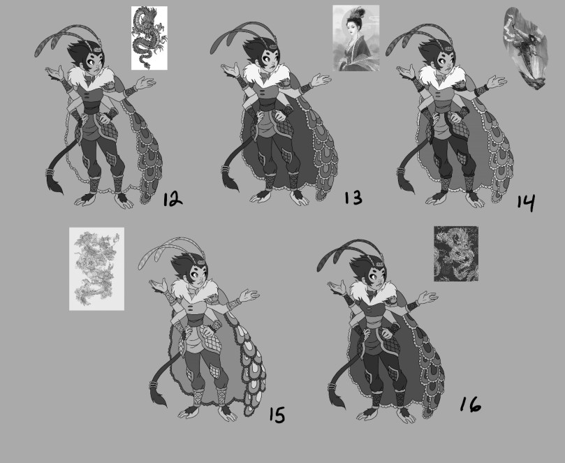
Ta, Trang. Longmu: Color Study. 2018, Digital.
The character was developed in black and white to explore value and contrast. The goal was to match the high contrast of Chinese Dragon dancers while also not losing the interest of having a mix of high and low contrast areas. This was achieved by systematically layering light on dark and vice versa to highlight important areas such as the face and the cape while also downplaying things that might not be as important, such as the rest of the outfit. Only once the values were established did I start applying any color to the character which I believed strengthened the final piece.
As an aspiring digital artist, it is difficult to not be influenced as someone so successful in the modern age as Loish. The expressiveness of her gesture is incredibly advanced and in her hands, the bare foundations of good-art making are utilized to their fullest potential.
Footnote
1 Baarle, Lois Van. “Interview With Horizon Zero Dawn Concept Artist-Loish.” Interview by Josie Price. Temple of Geek. September 12, 2017. Accessed September 14, 2018. https://templeofgeek.com/loish/.
2 Baarle, Lois Van. “Interview with Concept Artist Lois Van Baarle (Loish).” Interview by Miruna Sfia. Talk Illustration. December 6, 2013. Accessed September 14, 2018. https://talkillustration.com/interview-concept-artist-lois-van-baarle-loish/.
